Boston Bruins Change Iconic “Spoked-B” Logo for 2025-26 and Beyond, New Uniforms Coming – SportsLogos.Net News

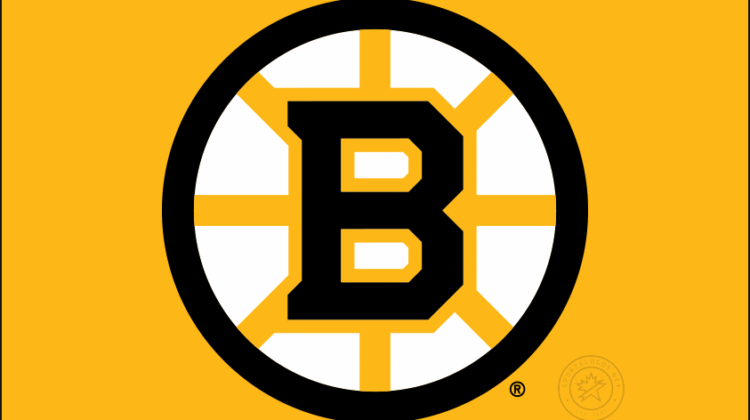
The Boston Bruins are changing their logo, bringing back what they used for their 100th season as their new permanent primary brand going forward.
The logo is a combination of the two iterations of the Bruins’ classic spoked-B design. The circle and spokes are lifted from what the club wore for nearly 50 years, from the late 1940s to mid-1990s, while the “B” inside the spokes is from the logo the Bruins have been using since 2007.
Boston announced the change to their familiar logo via a video posted to the club’s official website. An earlier post on their social media channels suggested an additional announcement would come on Wednesday; it is widely assumed this will be the release of their new uniforms, one of which had already leaked earlier this year.
The first Bruins’ “Spoked-B” logo debuted in 1948–49 as a commemorative 25th anniversary design, that first version of the logo featured a yellow “B” inside a black spoked circle with the years “24” and “49” on either side. The “B” was refined, and the years were removed the following season.
In 1995, the Bruins updated the spoked-B again as part of a broader redesign that coincided with the team’s move to a new arena. The revised version featured a heavier outline and modernized lettering, retaining the core structure of the previous logo. Team president Harry Sinden addressed concerns about potential overhauls in an interview with The Boston Globesaying, “It’s a pretty identifiable logo and you better be careful before you mess it up.”
Although the logo is often associated with Boston’s nickname as the “Hub of the Universe,” there is no documented evidence from the time to support this connection.

As mentioned earlier, this new version of the Bruins logo first appeared for a single season during the team’s 100th anniversary in the 2023–24 season. Throughout the regular season and playoffs, the Bruins wore this logo on their sweaters re-coloured to feature a metallic gold in place of the yellow. Neither the metallic gold, nor those uniforms, will be returning in 2025–26, instead we are expecting the Bruins to wear a design closer to what they wore during the 100th anniversary game on December 1, 2024against Montreal, a look that very closely resembles the uniforms worn by the club from the late 1960s to mid 1990s.
A follow-up graphic posted by the Bruins explained there will be two versions of this logo, one with the black circle, black B and yellow spokes — this to be used on white backgrounds and their road white uniforms; the other features a yellow circle, yellow B and black spokes, for use on black backgrounds and their home black jerseys. The Bruins had also used a two-logo system for several decades in the last half of the 20th Century.

Check back in on Wednesday for what we expect will be the unveiling of the new Boston Bruins uniforms for 2025-26 and beyond.


